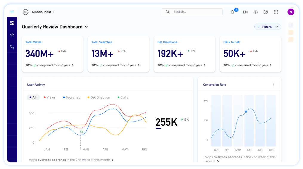
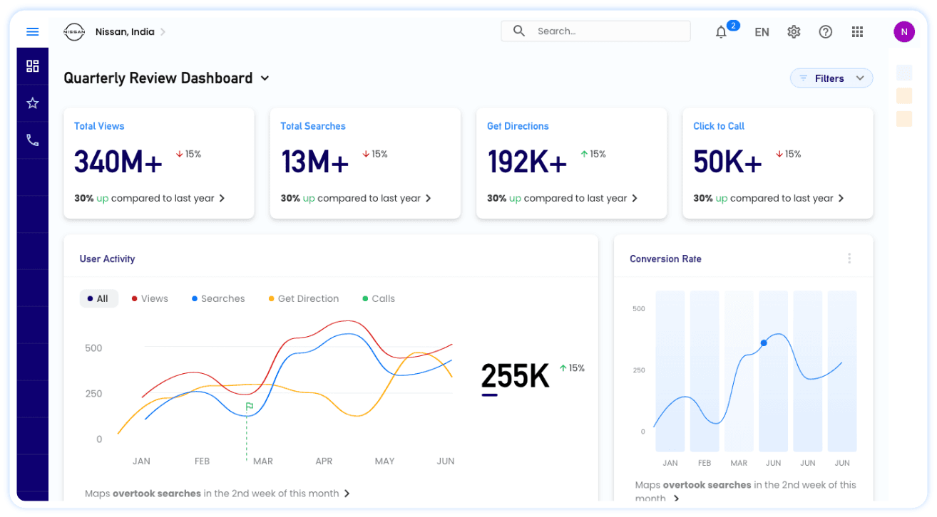
An overview
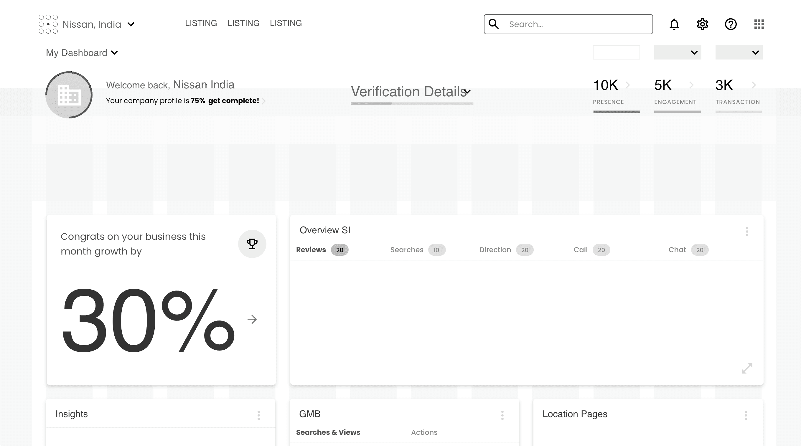
In a world where businesses operate across multiple physical locations, understanding and analyzing performance metrics becomes crucial for growth and optimization. This case study presents the design and implementation of a DIY dashboard tailored for businesses with multiple locations. The dashboard aims to provide users with key performance indicators (KPIs) such as views, clicks, and reviews for their business listings, along with the ability to create, edit, and share custom dashboards. With global and local widget-level filters, users can delve deep into data analytics for each location.
Let’s talk about the problem⁉️
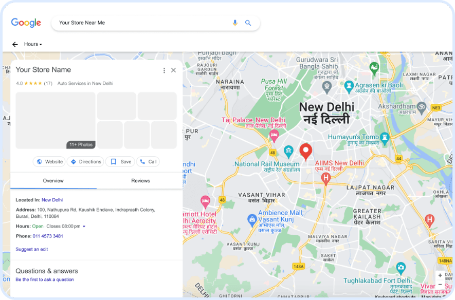
Businesses with multiple physical locations often struggle to efficiently track and analyze performance metrics across diverse sites. Existing solutions lack flexibility, intuitive interfaces, and comprehensive analytics tools, hindering effective decision-making and optimization.
Problem Analysis
Empathize Phase :
Conducted extensive user research and stakeholder interviews
Observed users in their natural work environments
Analyzed existing workflows and identified friction points
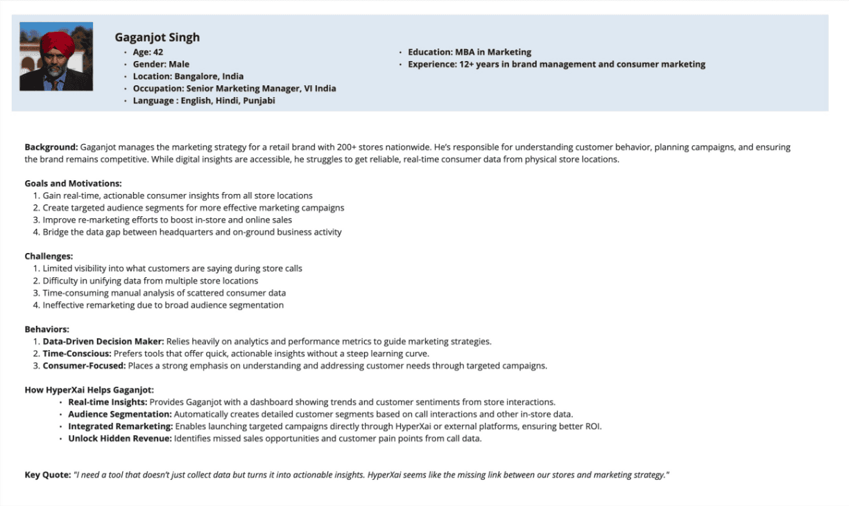
Developed comprehensive user personas.
Objectives/User Goals 🎯
Centralized Data Visualization : Provide a unified view of performance metrics across multiple locations.
Customization : Allow users to create and customize their dashboards based on specific needs.
In-depth Analysis : Enable detailed analysis through global and local filters.
User-friendly Interface : Ensure the dashboard is intuitive and easy to use for users with varying technical expertise.
Collaboration : Facilitate sharing and collaboration among team members.
The "Aha!" Moment: Understanding Our Users🧑🏻💻
Through conversations with business owners and marketing teams, I discovered something crucial: they didn't need more data—they needed the right data, presented in a way that sparked action.
What I learned:
Business owners wanted high-level insights to make strategic decisions
Marketing teams craved the ability to compare campaigns across different locations
Everyone was frustrated by analytics tools that required technical expertise to navigate
The Solution: Making Complex Simple
I designed a dashboard that feels as natural as checking your phone—but packs the analytical power of enterprise software.
Key Features that Changed the Game ✨
Smart Customization
Instead of overwhelming users with options, I created an intelligent widget system. Users can drag and drop the metrics that matter to them, creating personalized views that match their role and responsibilities.
Global vs. Local Intelligence
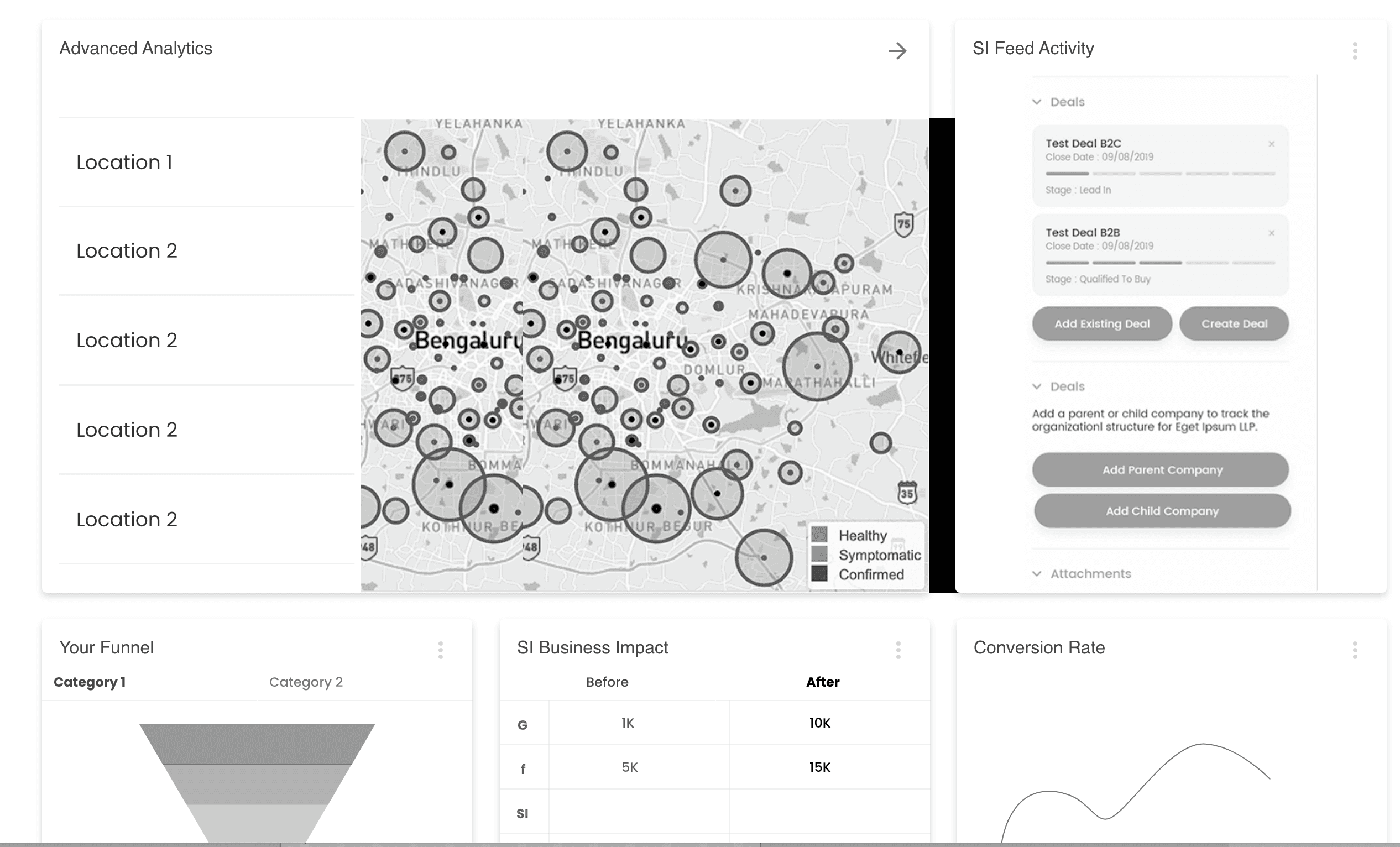
This was the breakthrough feature. Users can apply filters globally (seeing trends across all locations) or locally (diving deep into specific sites). It's like having both a telescope and a microscope in one tool.
Collaborative Decision Making
I built sharing and commenting features directly into the dashboard. Now teams can annotate insights, share discoveries, and make decisions together—even when they're miles apart.
Real-World Impact Tracking
The dashboard doesn't just show numbers—it connects those numbers to business outcomes. Users can see how changes in engagement metrics translate to actual revenue and growth.
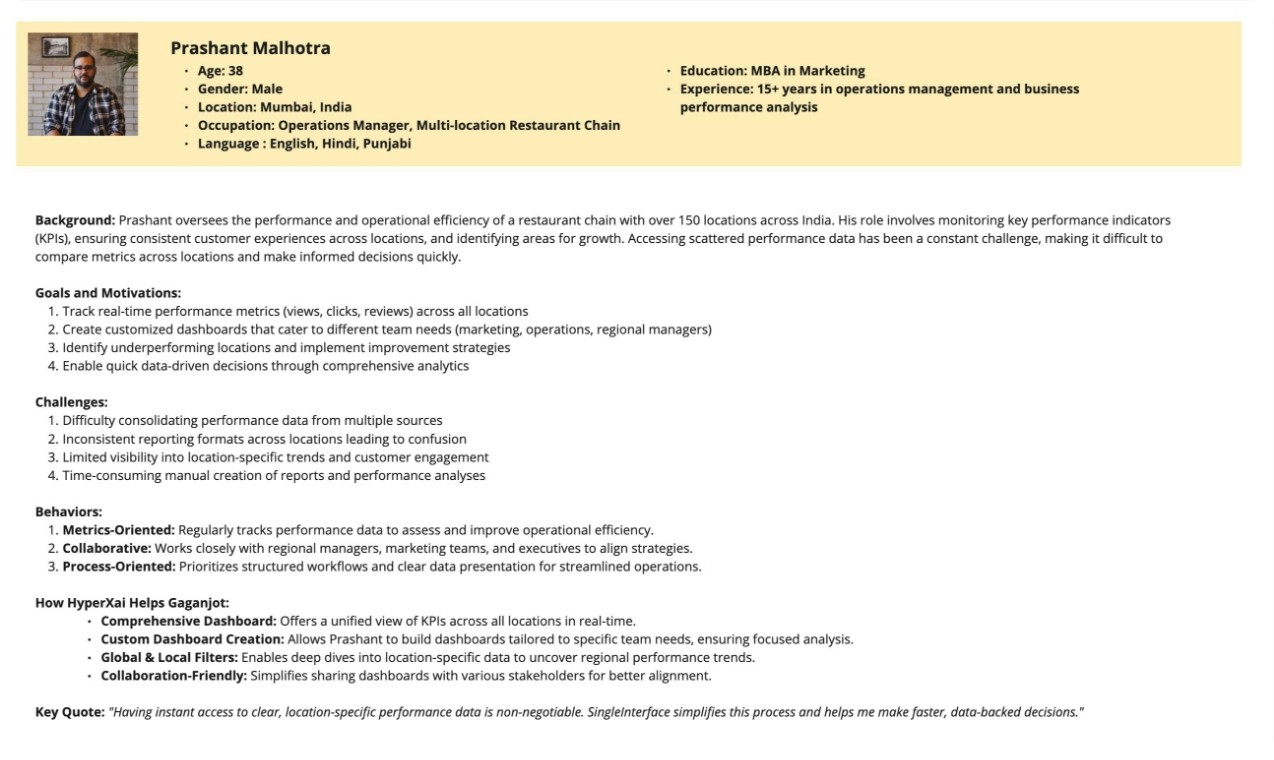
User Persona?
Initial Wireframes

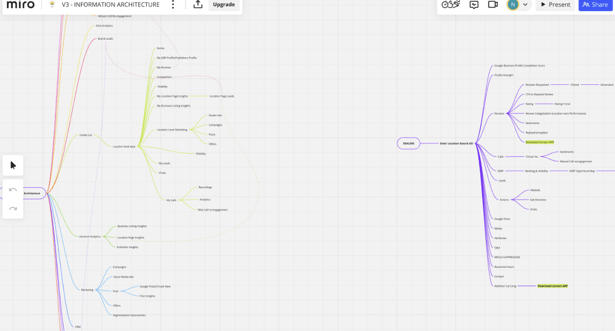
Information Architecture
SAAS Design System
Design system for SingleInterface, collection of reusable components, guidelines, and standards that ensure consistency and efficiency in creating user interfaces. It includes everything from typography, color palettes, and icons, to button styles, form fields, and layouts.


Interface Based Solutions
Here are the snapshots of few UI screens, login, dashboard, edit your dashboard and global filters and comparison.
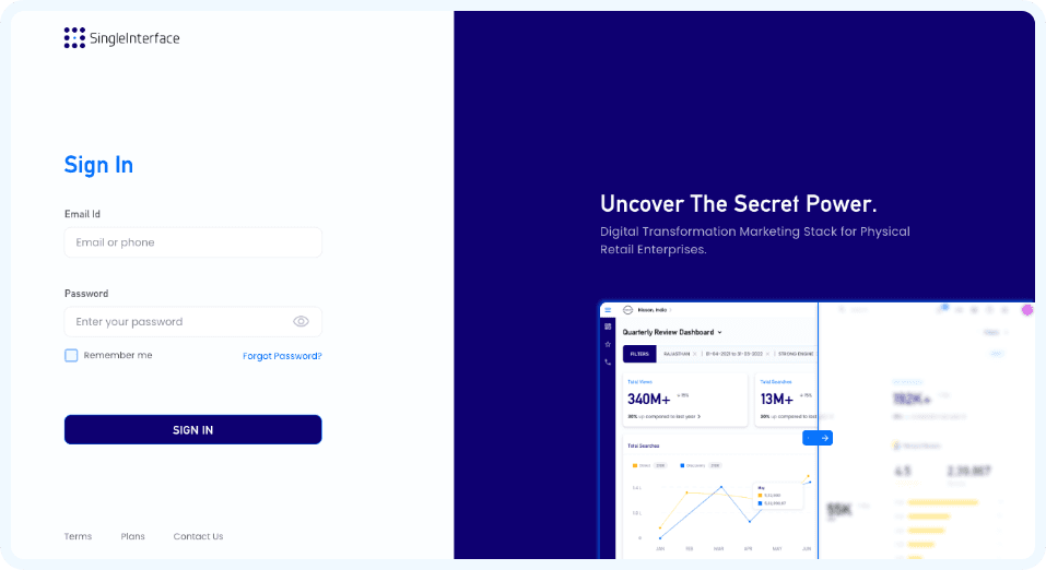
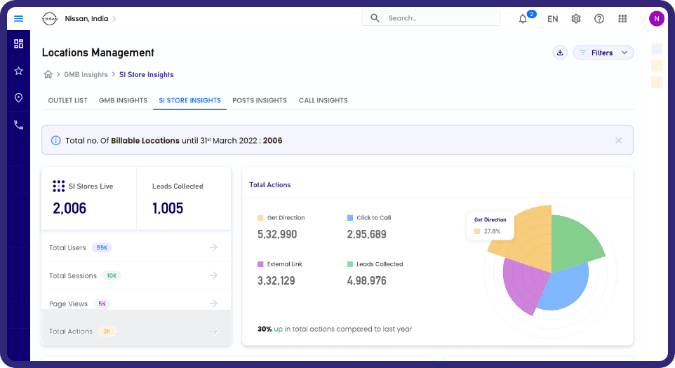
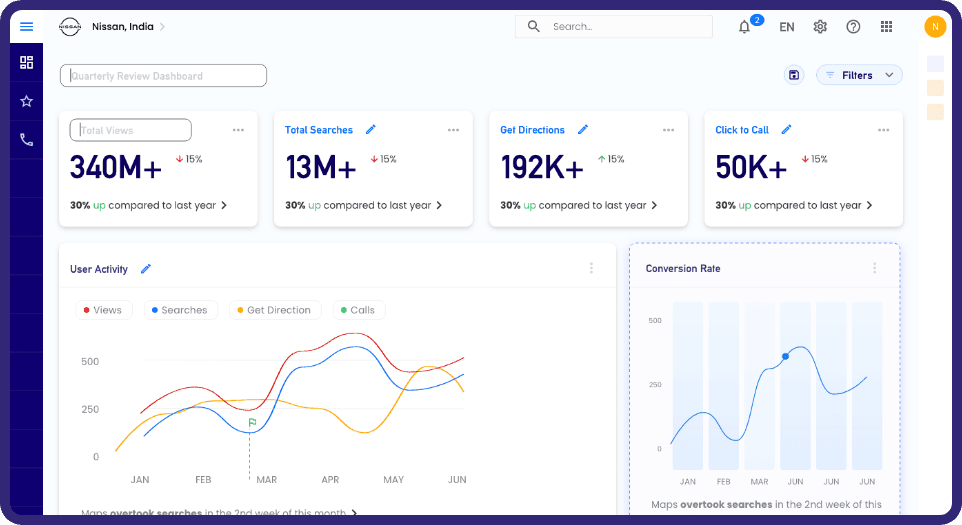
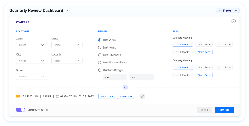
The Results That Matter 🏆
For Users:
Task completion time dropped.
Increase in user satisfaction scores.
Users successfully completed complex tasks for bulk locations without support
For Business:
Customer churn rate reduced within the first six months post-launch.
Support ticket volume decreased
The platform became a key differentiator in winning new customers
What I Learned Along the Way?
Start with Empathy, Not Features
My biggest breakthrough came from spending time watching real users struggle with existing tools. Their frustrations became my design constraints, and their workflows became my blueprint for success.
Simplicity is Sophisticated
The hardest design challenge was making complex data analysis feel effortless. Every interface element had to earn its place by making the user's job easier, not just looking impressive.
Collaboration Amplifies Impact
Working closely with developers, product managers, and actual users throughout the process meant fewer surprises and better solutions. Great design happens in community, not isolation.